
Gallery: 10 Best WWE WrestleMania Posters Of All Time
'The Films' must take note...
Posters are great, aren't they? We all like posters. If you're a child reading this illustrious website there's no doubt you have them covering every last inch of paint on your bedroom walls against the strictest orders of your parents. If you're an adult reading this illustrious website there's no doubt you've got a couple in frames, kidding yourself into thinking they look pretty 'sophisticated'.
Let's be real here, there's nothing like a WrestleMania poster. It's one of the ultimate collector's items for any WWE fan. Just looking back over the past 34 years has really opened my eyes to what wonderful pieces of artwork some of them truly are. As you'd expect, the modern day examples are made using the latest technologies and wouldn't look out of place in any given cinema's window. But the earlier 'Mania posters have a distinctive charm to them that has been lost along the way. Wrestling has started to take itself too seriously when it comes to its promotional material in more recent times and I want it to go back to the 1980s because as you're about to see, the posters were just better back then.
Let's start a movement - out with the high-resolution photos and the accompanying sleek graphical work to create something that looks cool to the masses. I want to see rubbish fonts, horrible colour schemes, original artwork of the Superstars and garish backgrounds plucked from the closest comic book to make a return! Somebody go make one of those petitions...
Here are the 10 best posters in WWE WrestleMania history...
 WWE
WWE
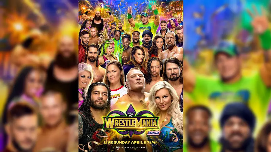
It might look like a Royal Rumble poster to the untrained eye but this is a lovely ensemble that just goes to show how stacked the roster is these days. A special shoutout to Braun Strowman, who looks like Batman & Robin's Bane should he have taken his mask off and lost the veins and greenness.
 WWE
WWE
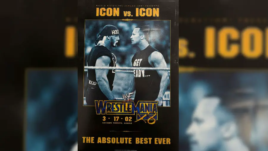
It's a simple design that looks like it's hyping a big boxing match rather than an event taking place on the Grandest Stage Of Them All. I bet the people who made this weren't expecting this showdown between Rocky and Hogan to be The Absolute Best Ever for the reasons some consider it to be - good on The Rock especially for listening to the crowd and letting Hulkamania run wild once more.
 WWE
WWE
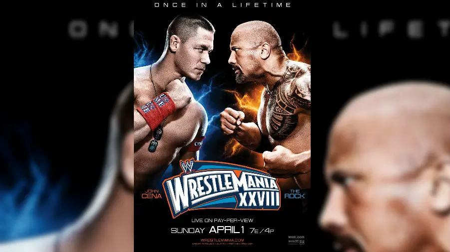
APRIL FOOLS HAHA LOL! This is the single biggest example of misrepresentation and false advertising in WWE history but it's also a sleek design in keeping with the stylish theme used at 'Mania 28. I always found it weird how the supposed Most Electrifying Man In All Of Entertainment has flame-like things coming off him while John is the one with a few volts of electricity emanating from his body...
 WWE
WWE
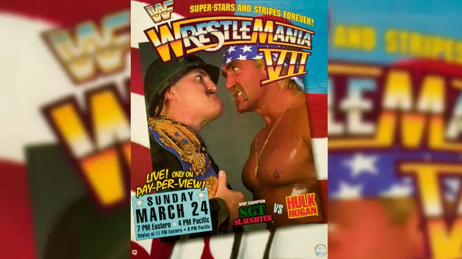
I'm no historian when it comes to WWE magazines from decades gone by, but I'll be shocked if this poster wasn't used on the front cover of WWF Magazine back around the time of 'Mania 7 because this poster looks like it belongs on a glossy piece of paper. Super-Stars And Stripes Forever - I've always got a lot of time for a good pun as well, mind you...
 WWE
WWE
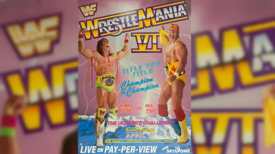
This is textbook 1980s and I love it. Of course Hulk Hogan and The Ultimate Warrior are three times the size of a huge set of mountains, and of course there's a pink sky with lightning bolts all over the shop. Why can't things be as brilliantly naff as this these days? We need to stop taking ourselves so seriously.
 WWE
WWE
It's a parody poster! Just like puns, I've always got a lot of time for parodies. Bless them; 20th Century Fox still doesn't know what hit them all these years later.
 WWE
WWE
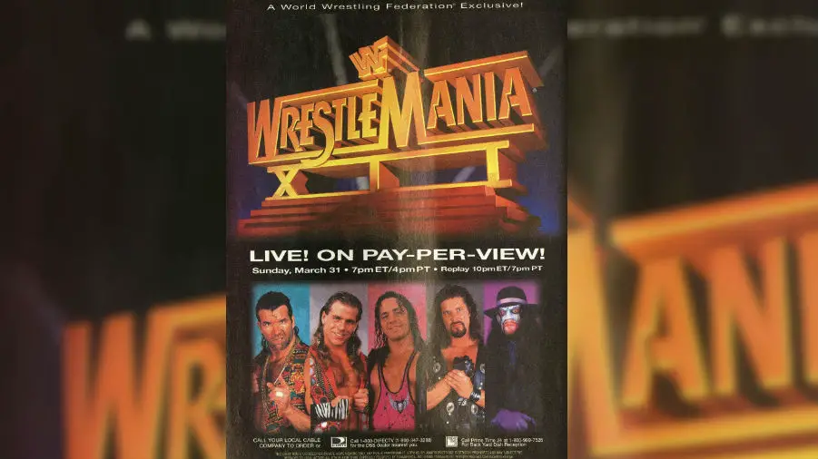
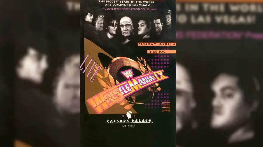
It's a poster that was made in 1993 even though by looking at it you'd think it was made in at least 1995... it's a classy little number that didn't think to include one little hint of the hokey rubbishness that awaited us in a Ceasars Palace carpark. Look at that start time too - madness!
 WWE
WWE
You just don't see original artwork like this anymore. Look a how friendly and welcoming this picture is - even though you know both men could quite literally kill you if given the chance... well, Hogan maybe. This was 1985 brother brother brother brother brother brother brother brother brother brother brother brother brother. I also like how Hogan is wearing his very early gear, while Mr T has his 'WWF' gear on - a shocking lack of attention to detail for sure. Still, this is a lovely looking thing.
 WWE
WWE
Just look at the people and the words in this poster and marvel at them. Absolute madness. WWE are lucky people actually turned up for this 'Mania and didn't believe it was the most elaborate April Fools ever. Obviously, we didn't know what was going to happen to Trump over the next decade but the fact he now is the world's most powerful man makes this poster all the more monumental - and mental.
 WWE
WWE
Hogan, Savage, original artwork, cartoon atom bomb clouds, horrible tacky fonts - this poster has the lot. Somebody should make modern-day equivalents of these posters because I'm sure they'd sell millions. The style just makes your heart soar with the eagle's nest, doesn't it?
Let's be real here, there's nothing like a WrestleMania poster. It's one of the ultimate collector's items for any WWE fan. Just looking back over the past 34 years has really opened my eyes to what wonderful pieces of artwork some of them truly are. As you'd expect, the modern day examples are made using the latest technologies and wouldn't look out of place in any given cinema's window. But the earlier 'Mania posters have a distinctive charm to them that has been lost along the way. Wrestling has started to take itself too seriously when it comes to its promotional material in more recent times and I want it to go back to the 1980s because as you're about to see, the posters were just better back then.
Let's start a movement - out with the high-resolution photos and the accompanying sleek graphical work to create something that looks cool to the masses. I want to see rubbish fonts, horrible colour schemes, original artwork of the Superstars and garish backgrounds plucked from the closest comic book to make a return! Somebody go make one of those petitions...
Here are the 10 best posters in WWE WrestleMania history...
10. WrestleMania 34
WWEIt might look like a Royal Rumble poster to the untrained eye but this is a lovely ensemble that just goes to show how stacked the roster is these days. A special shoutout to Braun Strowman, who looks like Batman & Robin's Bane should he have taken his mask off and lost the veins and greenness.
9. WrestleMania X8
WWEIt's a simple design that looks like it's hyping a big boxing match rather than an event taking place on the Grandest Stage Of Them All. I bet the people who made this weren't expecting this showdown between Rocky and Hogan to be The Absolute Best Ever for the reasons some consider it to be - good on The Rock especially for listening to the crowd and letting Hulkamania run wild once more.
8. WrestleMania XXVIII
WWEAPRIL FOOLS HAHA LOL! This is the single biggest example of misrepresentation and false advertising in WWE history but it's also a sleek design in keeping with the stylish theme used at 'Mania 28. I always found it weird how the supposed Most Electrifying Man In All Of Entertainment has flame-like things coming off him while John is the one with a few volts of electricity emanating from his body...
7. WrestleMania VII
WWEI'm no historian when it comes to WWE magazines from decades gone by, but I'll be shocked if this poster wasn't used on the front cover of WWF Magazine back around the time of 'Mania 7 because this poster looks like it belongs on a glossy piece of paper. Super-Stars And Stripes Forever - I've always got a lot of time for a good pun as well, mind you...
6. WrestleMania VI
WWEThis is textbook 1980s and I love it. Of course Hulk Hogan and The Ultimate Warrior are three times the size of a huge set of mountains, and of course there's a pink sky with lightning bolts all over the shop. Why can't things be as brilliantly naff as this these days? We need to stop taking ourselves so seriously.
5. WrestleMania XII
WWEIt's a parody poster! Just like puns, I've always got a lot of time for parodies. Bless them; 20th Century Fox still doesn't know what hit them all these years later.
4. WrestleMania IX
WWEIt's a poster that was made in 1993 even though by looking at it you'd think it was made in at least 1995... it's a classy little number that didn't think to include one little hint of the hokey rubbishness that awaited us in a Ceasars Palace carpark. Look at that start time too - madness!
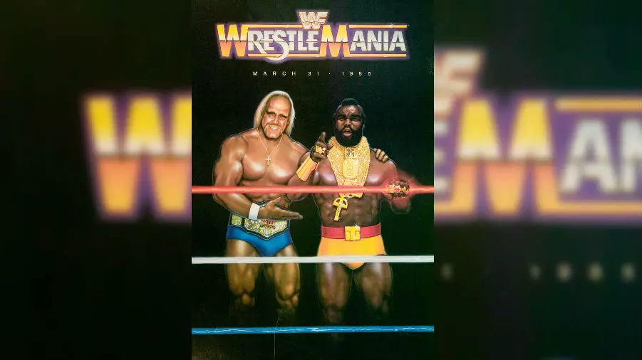
3. WrestleMania I
WWEYou just don't see original artwork like this anymore. Look a how friendly and welcoming this picture is - even though you know both men could quite literally kill you if given the chance... well, Hogan maybe. This was 1985 brother brother brother brother brother brother brother brother brother brother brother brother brother. I also like how Hogan is wearing his very early gear, while Mr T has his 'WWF' gear on - a shocking lack of attention to detail for sure. Still, this is a lovely looking thing.
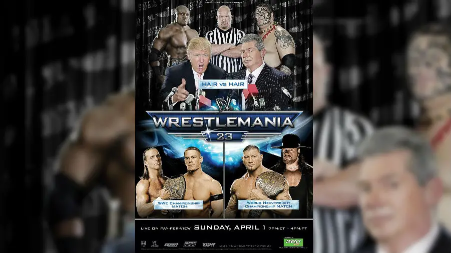
2. WrestleMania 23
WWEJust look at the people and the words in this poster and marvel at them. Absolute madness. WWE are lucky people actually turned up for this 'Mania and didn't believe it was the most elaborate April Fools ever. Obviously, we didn't know what was going to happen to Trump over the next decade but the fact he now is the world's most powerful man makes this poster all the more monumental - and mental.
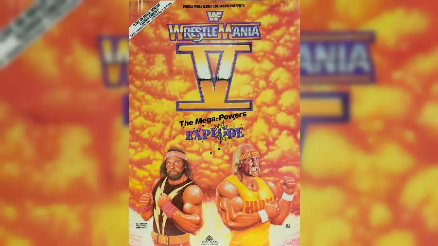
1. WrestleMania V
WWEHogan, Savage, original artwork, cartoon atom bomb clouds, horrible tacky fonts - this poster has the lot. Somebody should make modern-day equivalents of these posters because I'm sure they'd sell millions. The style just makes your heart soar with the eagle's nest, doesn't it?

Written by Ross Tweddell
Written and video journalist for Cultaholic Wrestling | twitter: @rossonrasslin | instagram: @rossonrasslin