Ranking Every WWE WrestleMania Stage From Worst To Best
It's the Grandest Stage Of Them All, you know...

Apr 3, 2018
WrestleMania is the Grandest Stage Of Them All, you know. For a very long time that was nothing more than a fancy tagline to market the biggest show of the year. In recent times, however, with budget cuts and the custom sets of old not transferable to the HDTV age, WrestleMania has quite literally become The Grandest Stage Of Them All because it's the only show that differs from the norm.
That's not a bad thing, mind you. I really like how almost every inch of Raw and SmackDown Live's sets are made of LED screens meaning they can show almost anything. Although, that being said, the likes of the Royal Rumble, SummerSlam and Survivor Series should really have bigger and better walkways - it all adds to 'Mania being the most special event of the year, I guess. I really don't know how I feel about the stages of today, do I?
Anyway, WrestleMania has been the biggest show of WWE's year for going on 34 years now and that means it has
the most
of everything. The most seats, the most dollars put into its production, and in turn, the most stage... it has the biggest and best stage, OK?!
Let's rank those elaborate tunnels and platforms from the worst to the very best...
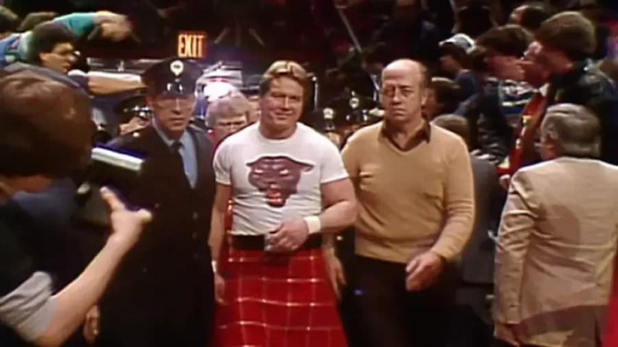
All the way back in 1985 there wasn't a stage, quite frankly. A lot of the Superstars who appeared on this show didn't even have the privilege of having their entrance aired to the closed-circuit TV audience, with many cutscenes involving 'Mean' Gene Okerlund and the commentators of the night taking their place.
It's fair to say if this entrance way belongs anywhere it's with Dale Winton or Anton du Beke on Prime Time ITV because it's nothing more than a HOLE IN THE WALL!
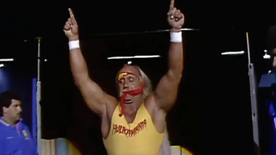
See the first ever WrestleMania's getup, make things a little less claustrophobic, copy, and paste. I hear large black curtains were all the rage back in the mid-1980s...
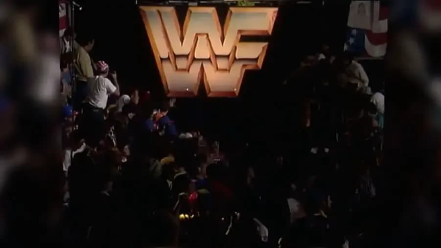
WrestleMania VII's entrance ramp took a massive step back compared to the look of the few years previous, with the large black curtains of the first two 'Manias being showcased once again.
This time, however, there was a massive lovely, sparkly logo which keeps this awkward entrance way from propping up this list. Of course, this entrance is perhaps the most awkward in 'Mania history due to the 90-degree angle that appears outta nowhere a few steps removed from the lovely black curtain. You make the best of what space you have, I guess...
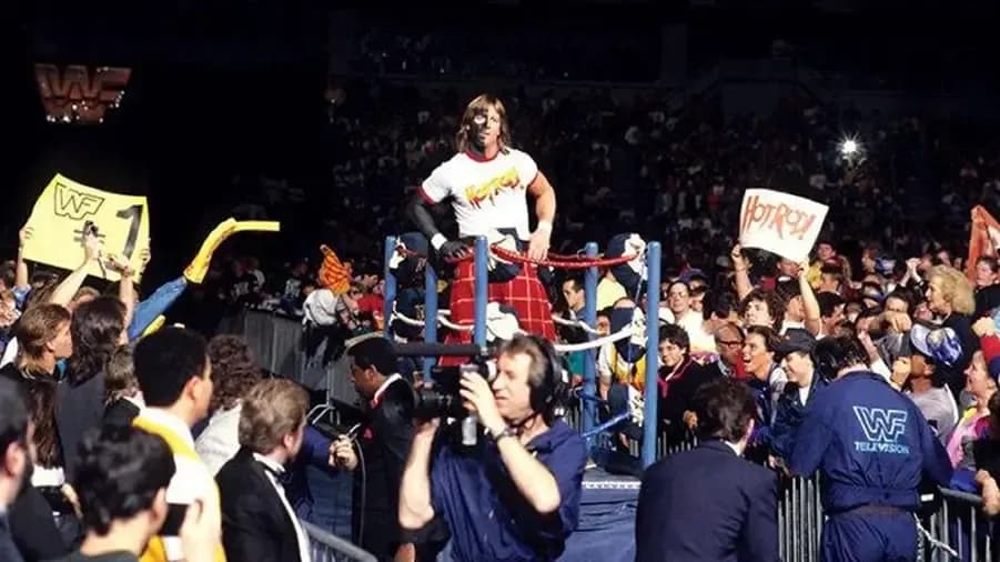
This picture has not aged well, has it? Nope. Not one bit. I'm sorry you've been forced to see this today.
Much like the WrestleMania III entrance way utilized the iconic small rings to get the Superstars down to the ring, 'Mania VI did the old 'can I copy your homework?' meme a generation or two before it even existed.
Nobody likes a copycat, though, so this one is ranking pretty low on the list. It does, however, look much more like the entrance ways were used to today so it can't be ranked too low compared to some of its predecessors.
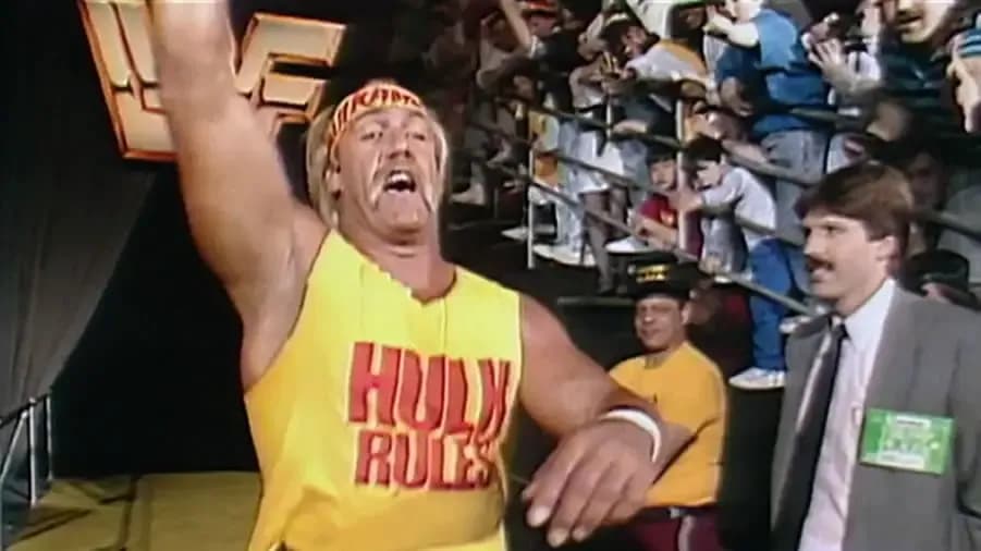
I'm a massive fan of the longer WrestleMania entrance ways and the one used at 'Mania V probably could have been seen from space like the Great Wall of China had it not been situated in an arena with a roof.
Seeing the Superstars quite literally have to battle their way through a rampant Atlantic City crowd is what I'm all about. I like to see people struggle in situations that should be easy, in theory. Even if the initial entrance way is pretty small and bland, WWE more than made up for this by having their Superstars walk down an impossibly narrow seven-mile track.
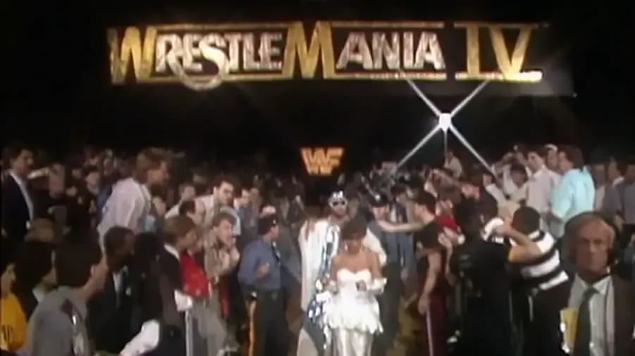
Take a black curtain the first couple of 'Manias would be envious of due to its sheer mass, the lovely looking logo used here there and everywhere back then, and then stick a huge
'WrestleMania IV'
logo above it and you have what is arguably the most conventional looking entrance way in the earlier years of the event.
Don't forget about the long entrance ramp. In the true spirit of WrestleMania, it started at one end of the arena and finished in a completely different town. Top marks!
While my penchant for a mile long WrestleMania entrance ramp still burns bright, you simply can't be a wrestling fan and not have an appreciation for the short ramp at Madison Square Garden.
'Mania X, fake President Clinton and all, used this little gem in all of its glory with some swanky gold trim to boot. Lovely stuff.
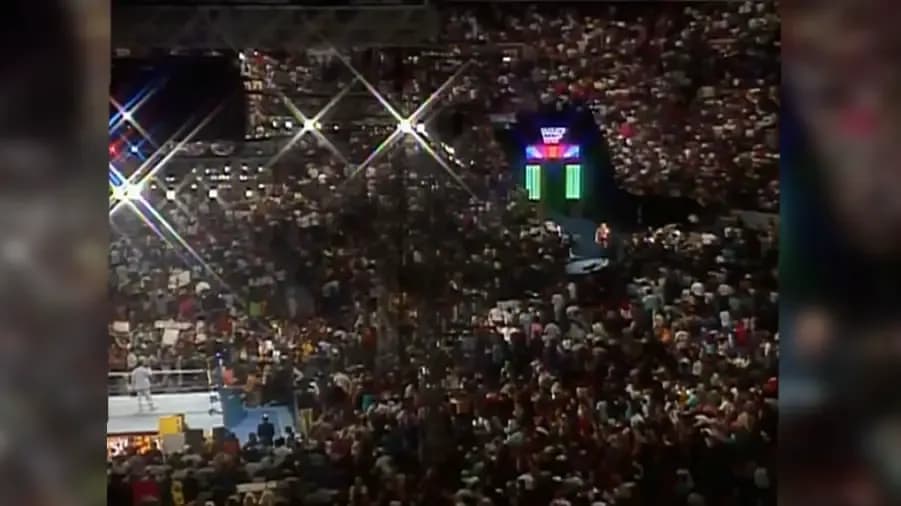
Now the old neon
New Generation
entrance way was a bit hit and miss with fans but because it was a big old leap forward compared to what we were used to back then, and because I like the pretty colours, it's a yes from me!
I'm sure some of you are arguing that this entrance way looks way too small compared to the crowd that surrounds it, but it has pretty colours and I REALLY, REALLY LIKE PRETTY COLOURS, OK?! I know some more of you might believe it's unforgivable that WWE were using the same entrance way they did for other shows on the show known as the
Grandest Stage Of Them All
, but times were tough back then. Have some empathy!
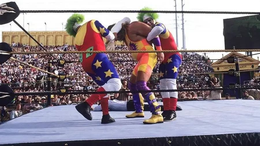
LOOK! IT'S A BLOODY ROMAN COLOSSEUM! LOOK AT IT. LOOK AT ALL OF THE FUN HAHAHA YES!
I love all of this, though. I love rubbish things. I love it when something is put on with the intention of being all kinds of FUN but just turns out to be all kinds of wrong. That being said, I doubt that if WWE were to wheel out a man pretending to be Caesar and a lady pretending to be Cleopatra to open a show today they'd get a positive response. Some people
actually
waved back in 1993 and seemed to be having a whale of a time, so good for them.
All of that being said WrestleMania IX's set is one of those iconic things about WWE from the early 90s, therefore, it can't have anything else but a fond place in your heart - no matter how rubbish you might think it is.
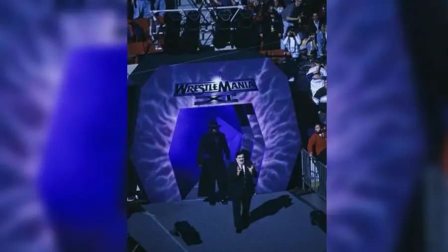
This is just all kinds of 'meh' isn't it? I know the pattern on what looks like nothing more than a plastic setting might have been construed as being cool back in 1995, but I would have expected more from WWF back then.
I know this look is consistent with a lot of the stages used during this time, but I want more because I'm an entitled fan on the internet. It's a good job the internet was as hard to use as a unicycle back then or two-and-a-half year old me would have left a less than enthusiastic review about the 'Mania XI set somewhere!
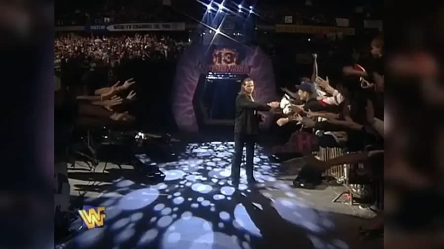
A few lighting improvements seem to be all we were offered when it came to 'Mania 13's entrance way and because I'm an entitled internet fan, I'm here to tell you that I WANT MORE!
Thankfully, WWE would change the look for the following year's 'Mania, with 14 including what should be seen as an upgrade on the look that had been used for the three previous 'Manias with a couple of tweaks here and there.
Of the three sets used during this purple phase of WrestleMania, 12's has got to be seen as a step up compared to its younger and older siblings.
It's just a nice layout, isn't it? I loved the way the crooked bit at the top would make for a lovely looking shot when the Superstars first appeared through the tunnel, while the way tron was revealed for a number of the entrances made for some nice little visuals compared to the lowly standards of the day.
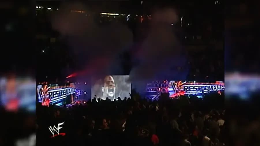
I know the injuries to Stone Cold Steve Austin and The Undertaker didn't help, but WrestleMania 2000 was absolutely terrible - the show's set didn't really do much to distract from what was happening inside the ring either.
I think this set looks like two massive lorries are parked up with a farily big screen in the middle, and because lorries simply do no belong on the Grandest Stage Of The All, this stage is probably ranking slightly lower than you thought it would.
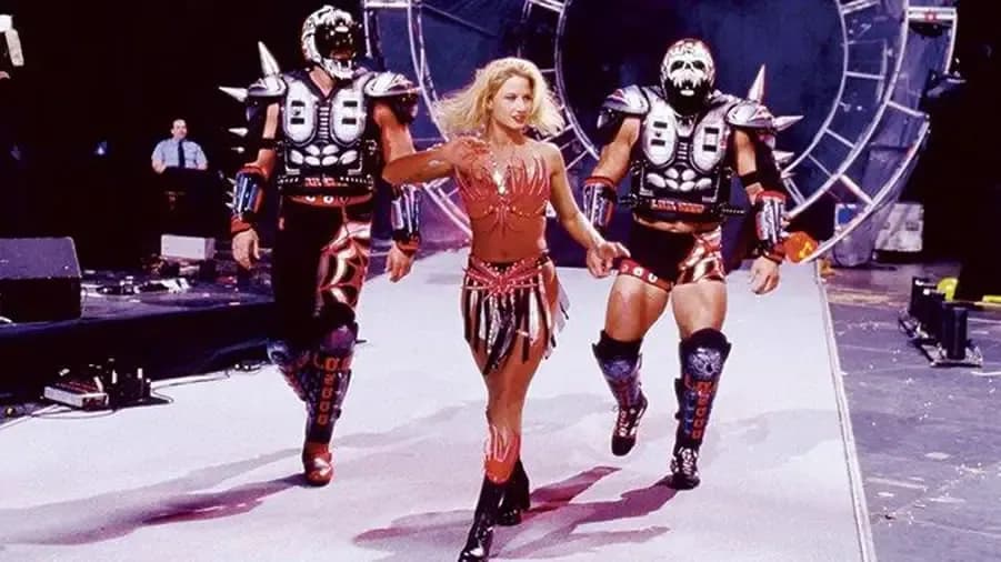
There's no doubt about it, some of you will be appalled that I've ranked this stage so high given the fact it was used for a number of PPVs during the Attitude Era. I know that in the intro to this piece I said that I believe WrestleMania's stage should be markedly better than the rest of WWE's looks throughout the year, but this one in particular gets a pass because this was used when I was getting intro wrestling. If we know anything by now it's that anything from
your
era of wrestling - no matter how rubbish, overused or uninspiring it might be - is better than anything else from any other era because
your
era is the best.
Because of this reason, with The Attitude Era being
my
era of wrestling, this one ranks higher than it should do. I bet more people might recognise this set from King of the Ring '98 when The Undertaker murdered Mankind twice - this list has descended into a shambles...
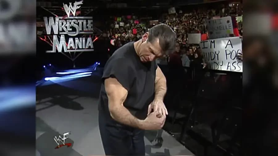
Again, this one might be ranked way higher than some of you thought it would be, but I like it. Yes, it's nothing more than a steel structure hanging infront of the black curtain of 'Manias past, but it's different and we haven't seen the likes of this since on the GSOTA!
Some say change is not good, but in this instance, I'd beg to differ.
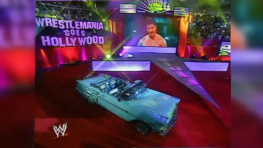
Hey, WrestleMania had a theme and this stage fit that theme - we knew what we were letting ourselves in for heading into 'Mania 21, and WWE did the best with the limited space inside Staples Center.
Hollywood, movie theatre - this stage is exactly what should be expected when the destination is earmarked as such on the marquee.
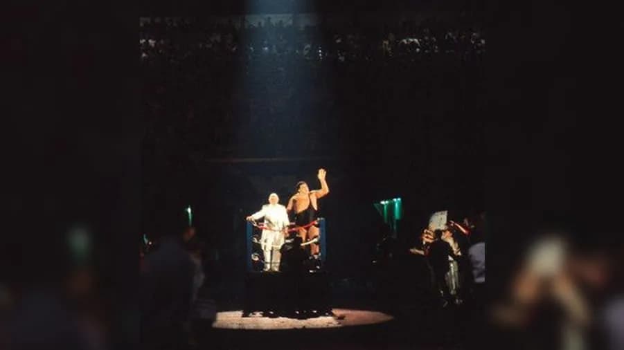
The little rings. It's all about the little rings...
Forget about the Superstars having to walk through nothing more than a hole in the wall to get onto the little rings, the fact the little rings are there means this is arguably the most iconic WrestleMania entrance way of all time - only held back by that dastardly void in the wall.
The little rings though - I'm getting emotional just looking at that image of Andre and The Brain.
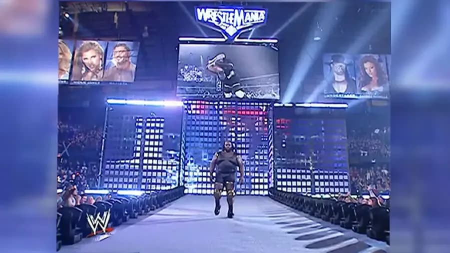
I like what WWE have done here in spite of the small space available to them inside Chicago's Allstate Arena (capacity just a shade over 17,000 for those counting along at home). The set looks a lot bigger than it should do inside an arena so small, so all credit to those in charge of production for pulling off an imposing look after a couple of years using smaller sets. We shouldn't have been getting used to smaller sets on the Grandest Stage Of Them All, should we?
It's also quite futuristic if you look closely, with all but the ramp itself made up by LED screens
just
like the sets of today. Granted those screens look like they're in prison, but this was 2006 for goodness sake!
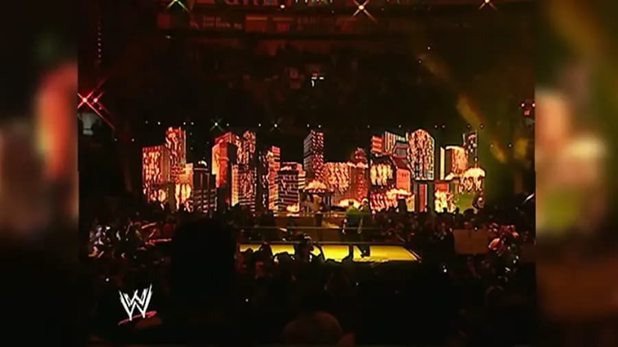
Yes I know it's small and yes I know the wrestling purists out there will have wanted to see the small MSG walkway being used but just look at the loveliness on show here.
Despite the fact this was early into 2004, WWE were able to produce a stage that wouldn't look out of place on a show today. Even the floor was animated - not quite as well as they are today, but it still looked awesome all the same.
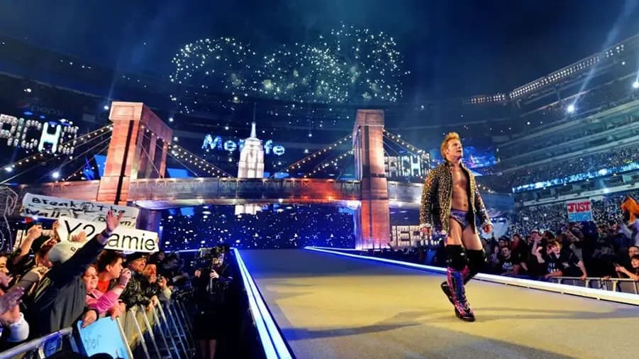
Just like Edge speaks of John Cena's promos on Raw in recent times, I believe that WrestleMania 29's set is just a bit too hokey to be considered as one of the GOATs.
I know WWE were coming back to their spiritual home of the North East but there's no need to shove all of the notable landmarks down our throats in such an overt way - we've all seen these things before. We've all got televisions for crying out loud!
Of course everything looked impressive but given the standards of the day, I thought this was a bit of a step back for WWE's 'Mania sets. It's still magnificent all the same, but I would have expected more imagination from 2013, you know?
You might have loved it, but such is life...
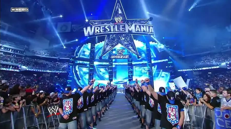
I really like the big star. I know that's quite the basic b*tch thing to say, but I really like it. It's big and sparkly and it says 25th anniversary even though it wasn't the 25th anniversary of WrestleMania - WHAT'S NOT TO LOVE?!
The long-arse walkway is always a hit with me as well, as you'll be well aware by now.
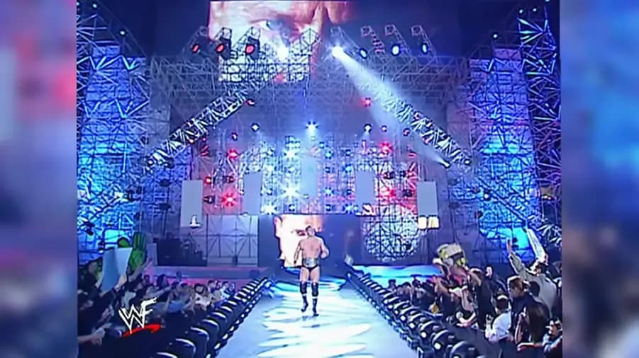
I love a mental WrestleMania set and 18's looked to be unthinkably massive on television. Some could argue that it looks like nothing more than a really big scaffold on a building site, while others will laugh at the fact Rob Van Dam got lost on his way to the ring in the opening match of the night.
2002 was a far more grittier time in WWE, so I think this set works. PLUS IT'S REALLY MASSIVE! DON'T FORGET HOW BIG IT IS!
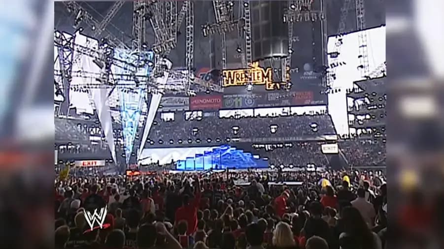
Some may argue that for the size of the arena this set is
way
to small, but naturally because I'm a contrarian, I disagree. I like the way this set harks back to WWF arenas of old by allowing fans to sit behind the set rather than cutting off an entire side of the area. I also like the big thing to the left - I know that once again I'm providing you with some basic b*tch analysis, but bigger is better when it comes to 'Mania stages and that thing is monstrous!
Again, despite the fact we're in the early stages of 2003 here, this is a set that looks to the future with the majority of it made up by LED screens.
A shoutout must also go to the massive bend in the walkway, the last of its kind. We don't see enough bendy walkways these days, so let's pay homage to that bendy walkway with a moment of silent reflection...
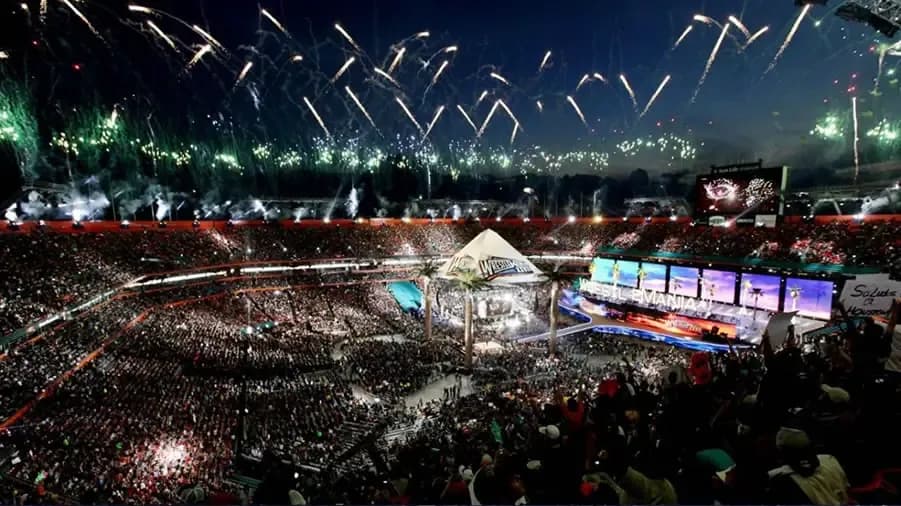
The Honky Tonk Man might have been cool, cocky and bad but this entrance way is sleek, stylish and rad... yes, I believe this is one of the cooler designs we've seen over the past 34 years.
Again, WWE did the best with the space available to them while allowing as many fans as possible to cram inside Sun Life Stadium - and they did so with all of the panache of David Beckham's early 2000s sarong.
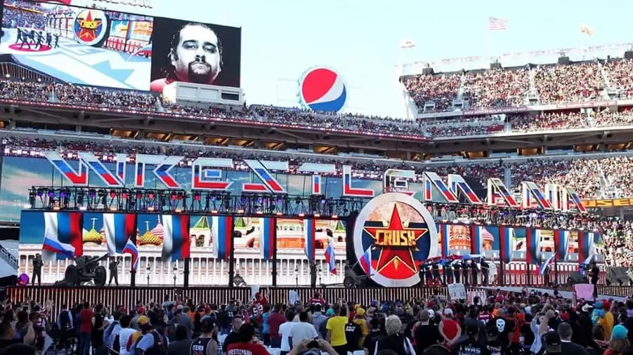
You take WrestleMania 28's stage, make it slightly bigger (that's the way it looked to me on television at least) and add a screen up top. This is an upgrade on Sun Life Stadium's efforts and due to the nature of this list, of course this one should be ranked one place higher.
Progression.
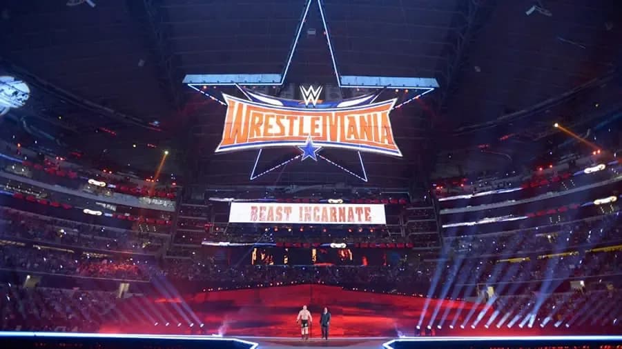
IT'S A MASSIVE STAR! LOOK! A MASSIVE STAR! OMG!
It's a bloody impressive sight with the right filter on, isn't it? Being inside the arena and not quite being able to see the entire thing undersold this entrance way considerably. However, when you see it all laid out like this, you realise it's perhaps the most clever use of the tools already in place. All they've done is erected a smaller stage, floated a nice looking star up there and commandeered an LED board that was already in place to create a scene that dominates an arena that has more seats than Jerry Lawler's had girlfriends.
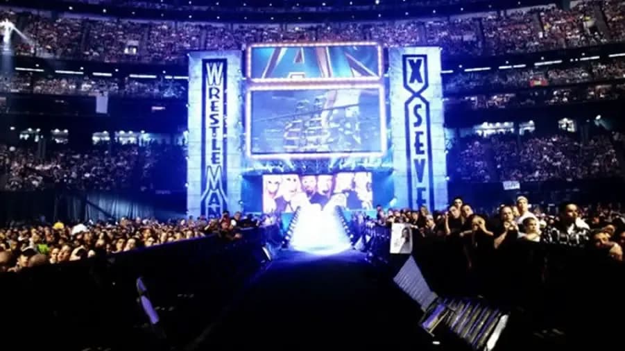
Look at the size of that! Never before had we seen a stage like this so the leap forward in size, girth, and screens on offer cannot be underestimated.
I guess it also helps that this was the setting for the greatest WrestleMania of all time. Good things always look prettier in the ol' memory banks.
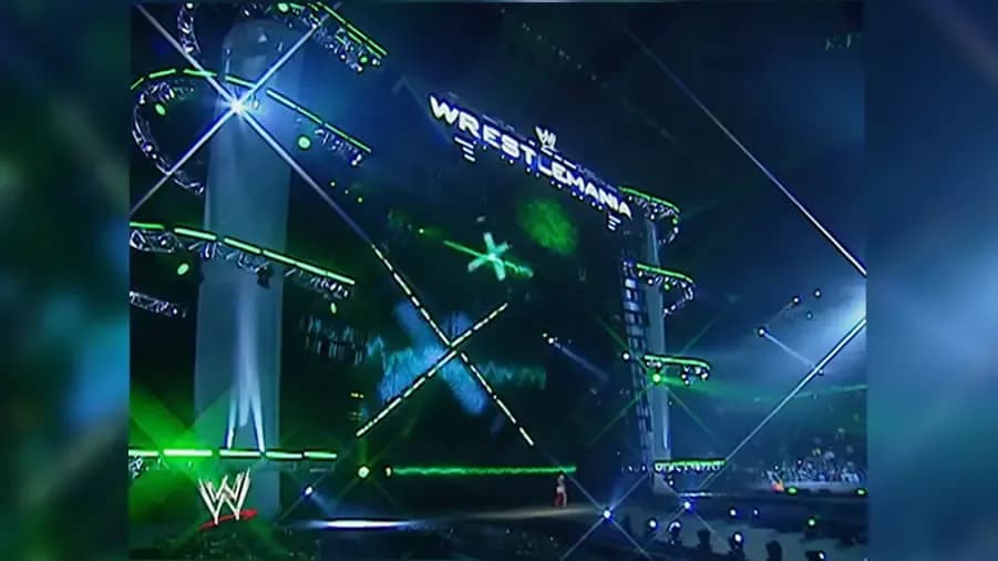
It's like WrestleMania's 17's stage was six years younger and utilised the technological advances developed during that time.
I like things that show progression, and this stage has roughly six year's worth all over it.
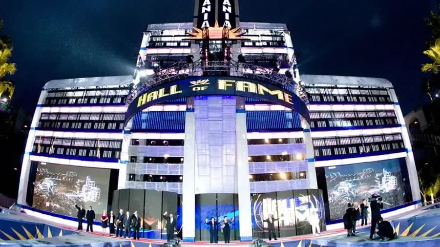
Perhaps the tallest WrestleMania stage of all time - bigger is better, you get the picture by now.
To some, this may look like an office building but to me, it looks like an office building with a couple of massive cinema screens on either side and who wouldn't want to have access to a couple of massive movie screens at work?!
Also, the pillar in the middle doesn't half remind me of the Warner Bros cinema in my hometown of Newcastle upon Tyne. That was a nice place to go before it was unceremoniously closed, therefore WrestleMania 24 is a nice place too.
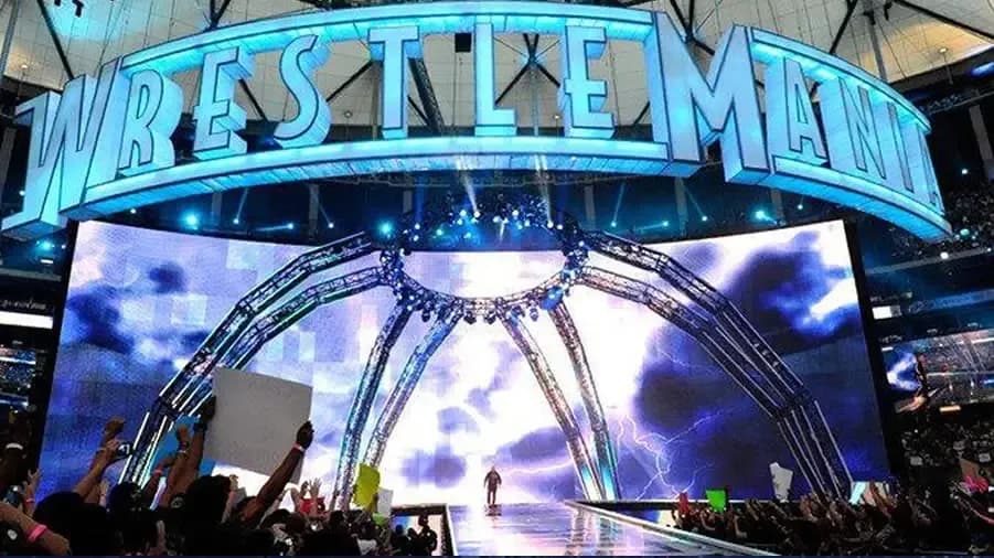
Arguably the simplest design of the modern era, but certainly the most mouldable if that makes any sense to you...
It's a massive screen - that's it. No matter what you put on that massive screen it's the easiest set to make unique to a certain Superstar, and looking at the likes of Triple H and The Undertaker's entrances especially here, why on earth they haven't just used a massive screen more often is rather perplexing to me. The looked bloody delicious!
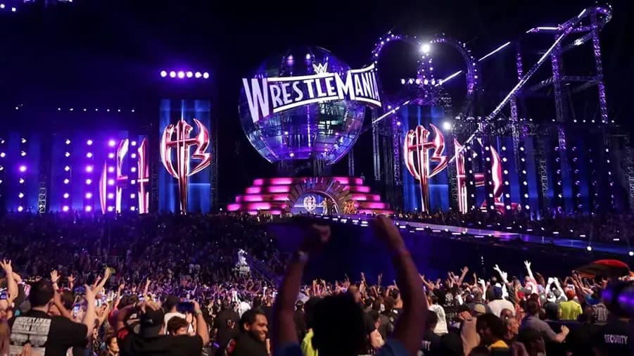
Give me the green light, because I'm ready to go, go, go... on a massive roller coaster across half of the WrestleMania 33 set.
Again, it's the size of the thing that blows you away. Some may argue this is as hokey as a 'Mania 29 set, but for me, the ratio of tat to 'WOW!' is just right here. If there was a set of spinning cups, a log flume, and haunted house up on that stage I'd be dropping this entrance down this list like Baron Corbin does briefcases. But it hasn't, so it's great.
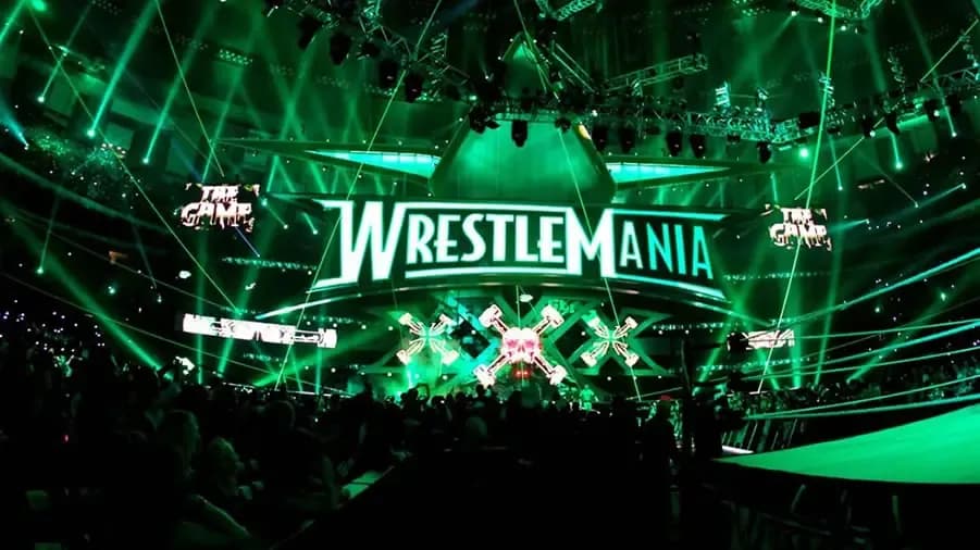
It's just really nice, isn't it? There are no complaints from me here. Everything just works as it should, although I have to say the length of the ramp is the only thing keeping this entrance way from the top spot in this list.
I'm not sure if they can elongate Sunday's ramp (given that 'Mania 34 is in the same building as 30) but if they could that would be great, thanks. I'm not asking for too much here, am I?
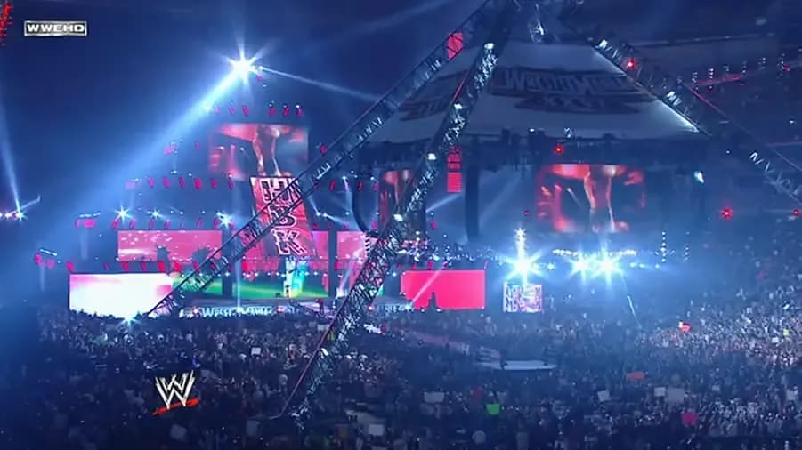
It's just ridiculous. It's a massive pyramid of joy and technological wonder... then you get to the canopy above the ring and that's more impressive than just about every set before 2001.
Everything about this is massive and spectacularly unnecessary and that's how it should be at
every
WrestleMania - for it is the Grandest Stage Of Them All didn't you know?